
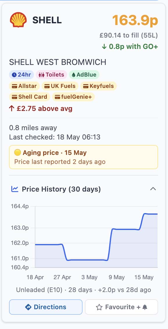
The new Price History (30 days) section, shown here expanded on a station card.
What you'll see on each station card
At the bottom of every station card, just below the live price and station details, there's now a new section labelled "Price History (30 days)" with a small chart icon and a chevron arrow. It starts collapsed so it doesn't clutter the card — but tap or click it, and the section expands to reveal a clean line chart showing that station's price for the fuel you're currently viewing, going back up to 30 days.
Underneath the chart you'll see a short summary line like "Unleaded (E10) · 28 days · +2.0p vs 28d ago" so you can see at a glance whether this particular forecourt is moving up, moving down, or holding steady.
The chart is interactive: hover or tap any point on the line to see the exact price for that day. Look for flat plateaus, sharp climbs, or the slow drift-down that often follows when wholesale prices ease.
Why we built it
Live prices are great — they tell you what to pay right now. But they don't tell you whether the price you're looking at is genuinely cheap for that station, or if it's actually 3p above where it's been sitting for most of the month. They don't show you whether your usual forecourt is on the way up or on the way down. And they don't help you spot the difference between a forecourt that drops slowly when wholesale prices fall, and one that drops quickly.
The classic complaint about UK forecourt pricing is the "rocket and feather" effect: pumps shoot up like a rocket the moment crude rises, then drift down like a feather when crude falls. Until now, the only way to test that was to remember what you paid last week. Now you can just look.
Where to find it
The Price History section appears at the bottom of every station card across the site:
- Fuel Map (map.php) — open any station popup or the sidebar card, scroll to the bottom, tap "Price History (30 days)".
- Home page (/) — after you search a postcode, the result cards each have the new section.
- Journey planner (journey.php) — every station shown along your route has its own history chart.
- Favourites (favourites.php) — your saved stations all get the chart too, defaulted to Unleaded (E10).
On the Map, Home and Journey pages, the chart matches whatever fuel type you have selected at the top of the page (E10 / E5 / B7 / SDV). On Favourites it defaults to E10 because there's no fuel selector on that page.
How to read the chart
The chart is deliberately simple — a single line, time along the bottom, price in pence up the side, and a summary underneath. There are a few quick ways to use it:
Three things to look for:
- The shape, not the spike. A station that's been climbing steadily for three weeks is in a very different situation to one that jumped 4p overnight and is now flat. The shape of the line tells you which.
- Compared with the last fortnight, where is the price today? If today's price is well above the running average of the chart, this forecourt is on a high — it's worth checking a couple of competitors before filling up.
- How quickly does it move after wholesale changes? Wholesale prices feed through to forecourts over one to three weeks. Stations that respond quickly tend to be cheaper overall; stations that drag their feet on cuts often stay above local averages.
How the data is collected
Live forecourt prices are published by every petrol retailer in the UK as part of the Government's mandatory Fuel Finder transparency scheme, which has been fully enforceable since 1 May 2026. We collect that feed every 15 minutes for over 7,400 stations and store a clean daily price for each one. That's what powers the chart — one honest data point per station per day, going back up to 30 days.
Crucially, the chart shows real prices for the real station you're looking at — not a regional average, not a brand-wide number, not a forecasted figure. If your local Shell is on the chart, the line you're seeing is what that Shell charged on each of the past 30 days, as reported to the Government feed by the retailer themselves.
A note on newer stations
A small number of stations on the site are very new — either newly opened, recently rebranded, or only recently picked up by the Fuel Finder feed. If a station hasn't been in our data long enough to draw a meaningful chart yet, you'll see a short message saying "Not enough price data yet for this station" instead. That station will appear in the chart in the coming days as more daily prices come in.
Why we say "up to 30 days": the chart will show as many days of data as we have for that station. For most forecourts on the site this is now the full 30 days. For very new entries it may be fewer until we've collected enough.
What's coming next
The 30-day chart is the start, not the finish. Over the coming weeks we'll be rolling out further improvements to help you make even better use of the price history data:
- Longer time ranges. Once we've collected enough data, you'll be able to switch between 7 / 14 / 30 / 90-day views to see longer-term trends.
- A dedicated price history page with comparison views by area and brand, designed for journalists, fleet managers and anyone curious about how UK fuel pricing actually behaves day to day.
- Smarter price-drop alerts. For drivers using our push notifications on favourites, the price history will feed into the alert system so we only ping you when a price drop genuinely matters versus that station's recent range.
How to try it now
- Open the Fuel Map, the home page, the journey planner or your favourites.
- Find a station card you're interested in — your usual forecourt is a good place to start.
- Scroll to the bottom of the card and tap or click "Price History (30 days)".
- The chart will load in a second or so. Have a proper look at the shape of that line — it'll often tell you something interesting about how that particular forecourt has been behaving.
The practical takeaway: the cheapest forecourt today isn't always the cheapest forecourt this week. A 30-day chart gives you a much clearer picture of which local stations consistently sit below the local average versus which ones occasionally dip down to look competitive. If you fill up every week or two, finding a forecourt with a flatter, lower line is worth more than chasing a one-day discount somewhere else.
Feedback welcome
This is a brand-new feature and we'll be tweaking it based on what drivers find useful. If something looks off on a particular station's chart, or there's a view you'd like to see added, please get in touch via the Contact Us page. The whole point of the chart is to make the data work harder for drivers — so the more feedback we get, the better we can shape what comes next.